Coxcomb plots and 'spiecharts' in R
After switching to a new site I decided to revive some old posts.
I found this one that was written back 7 years ago (in January 2021 when this update was written), back in December 2013.
The results of the book are now published in the book Low Impact Living: A Field Guide to Ecological, Affordable Community Building (Chatterton, 2015, for more info on the Lilac project in particular and cohousing in general see lilac.coop/resources/).
I was amazed to find that, with some tweaks, the ggplot2 code still ran.
I was contacted recently by a housing organisation who wanted an attractive visualisation of their finances, arranged in a circular form. Because there were two 4 continuous variables to include, all of which were proportions of each other, the client suggested a plot similar to a pie chart, but with each segment extending out a different radius from the segment. I realised later that what I had been asked to make was a modified coxcomb plot, invented by Florence Nightingale to represent statistics on cause of death during the Crimean War. In fact, I had been asked to make a “spie chart.” This post demonstrates, for the first time to my knowledge, how it can be done using ggplot2. A reproducible example of this, including sample data input, can be found on the project’s github repository: https://github.com/Robinlovelace/lilacPlot . Please fork and attribute as appropriate!
Reading and looking at the data
This is the original dataset I was given:
u <- "https://github.com/Robinlovelace/lilacPlot/raw/master/F2.csv"
f <- read.csv(u)
knitr::kable(f[1:3, ])| H | Value | Value.P | Allocation | Deposit | Captial | Debt | Cap | Contribution | Repayments |
|---|---|---|---|---|---|---|---|---|---|
| q | 163827 | 0.065 | 0.979 | 16382 | 147445 | 0 | 2457.405 | 1287.24 | 0.00 |
| a | 165994 | 0.066 | 1.022 | 16599 | 5488 | 138847 | 2489.910 | 208.02 | 208.02 |
| z | 159425 | 0.063 | 0.933 | 15943 | 76632 | 63601 | 2391.375 | 995.46 | 995.46 |
Without worrying too much about the details, the basics of the dataset are as follows:
- One observation per row, these will later be bars on the box plot
- Two components of data - captital and revenue
- Different orders of magnitude: some data is in absolute monetary terms, some in percentages
Base on the above points, a prerequisite was to create preliminary plots and manipulate the data so it would better fit in a coxcomb plot.
The first stage, however, is to demonstrate how the addition of
coord_polar to a barchart can conver it into a pie chart:
library(ggplot2)
(p <- ggplot(f, aes(x = H, y = Allocation)) + geom_bar(color = "black", stat = "identity",
width = 1))
plot of chunk unnamed-chunk-2
p + coord_polar()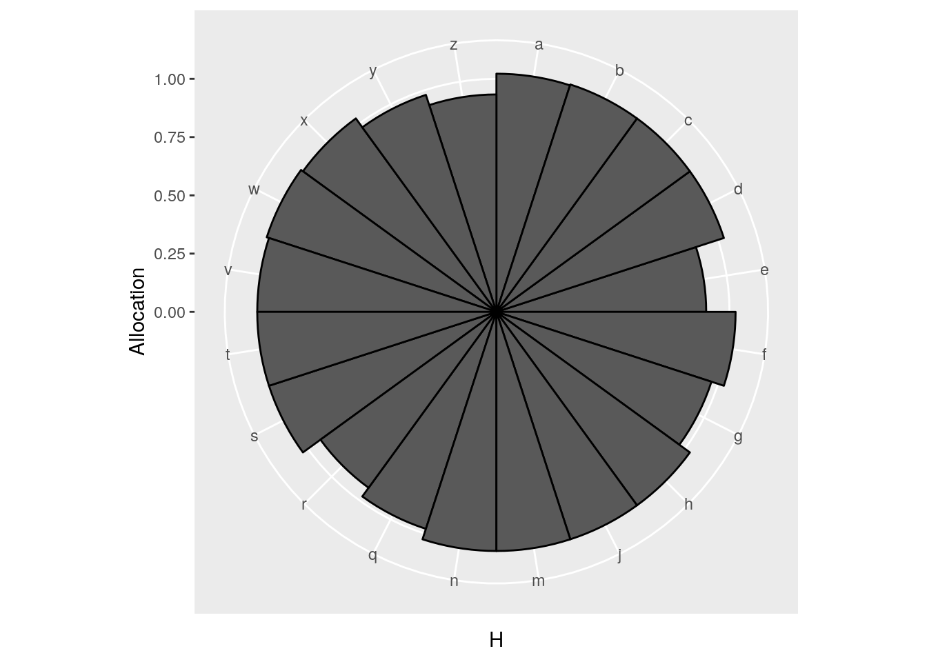
The above example works well, but notice that all the bars are of equal widths.
What we want is to be proportional to a value (variable “Value”) of each observation.
To do this we use the age-old function cumsum, as described in an
answer to a stackexchange question.
w <- f$Value
pos <- 0.5 * (cumsum(w) + cumsum(c(0, w[-length(w)])))
(p <- ggplot(f, aes(x = pos)) + geom_bar(aes(y = Allocation), width = w, color = "black",
stat = "identity"))
p + coord_polar(theta = "x") + scale_x_continuous(labels = f$H, breaks = pos)
Finally a spie chart has been created. After that revelation, it was essentially about adding the ‘bells and whistles’, including a 10% line to represent how much more or less than their share each observation was paying.
Adding the 10 %
f$Deposit/f$Value## [1] 0.09999573 0.09999759 0.10000314 0.09999837 0.10000120 0.10000000
## [7] 0.10000311 0.10000085 0.10000511 0.10000356 0.09999676 0.09999700
## [13] 0.09999812 0.10000511 0.10000085 0.10000240 0.10000000 0.10000694
## [19] 0.09999901 0.09999883# add 10% in there
p <- ggplot(f)
p + geom_bar(aes(x = pos, y = Allocation), width = w, color = "black", stat = "identity") +
geom_bar(aes(x = pos, y = 0.1), width = w, color = "black", stat = "identity",
fill = "green") + coord_polar()
# make proportional to area
f$Allo <- sqrt(f$Allocation)
p <- ggplot(f)
p + geom_bar(aes(x = pos, y = Allo, width = w), color = "black", stat = "identity") +
geom_bar(aes(x = pos, y = sqrt(0.1), width = w), color = "black", stat = "identity",
fill = "green") + coord_polar()## Warning: Ignoring unknown aesthetics: width
## Warning: Ignoring unknown aesthetics: width
# add capital
capital <- (f$Captial + f$Deposit)/(f$Value) * f$Allocation
capital <- sqrt(capital)
p + geom_bar(aes(x = pos, y = Allo, width = w), color = "black", stat = "identity") +
geom_bar(aes(x = pos, y = capital, width = w), color = "black", stat = "identity",
fill = "red") + geom_bar(aes(x = pos, y = sqrt(0.1), width = w), color = "black",
stat = "identity", fill = "green") + coord_polar() + scale_x_continuous(labels = f$H,
breaks = pos)## Warning: Ignoring unknown aesthetics: width
## Warning: Ignoring unknown aesthetics: width
## Warning: Ignoring unknown aesthetics: width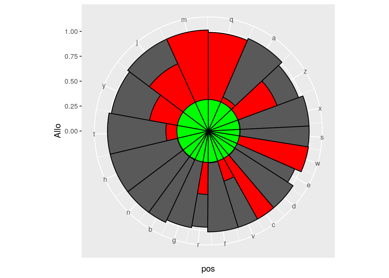
# add ablines
p + geom_bar(aes(x = pos, y = Allo, width = w), color = "grey40", stat = "identity",
fill = "lightgrey") + geom_bar(aes(x = pos, y = capital, width = w), color = "grey40",
stat = "identity", fill = "red") + geom_bar(aes(x = pos, y = sqrt(0.1),
width = w), color = "grey40", stat = "identity", fill = "green") + geom_abline(intercept = 1,
slope = 0, linetype = 2) + geom_abline(intercept = sqrt(1.1), slope = 0,
linetype = 3) + geom_abline(intercept = sqrt(0.9), slope = 0, linetype = 3)## Warning: Ignoring unknown aesthetics: width
## Warning: Ignoring unknown aesthetics: width
## Warning: Ignoring unknown aesthetics: width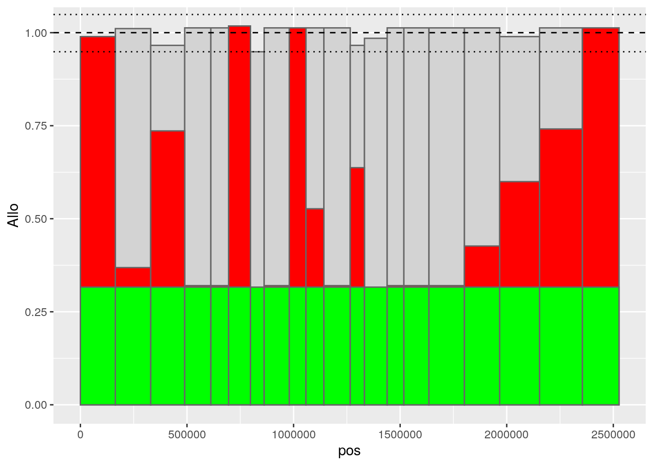

plot of chunk unnamed-chunk-4
# calculate vertical ablines of divisions
v1 <- 0.51 * f$Value[1]
v2 <- cumsum(f$Value)[17] + f$Value[18] * 0.31
v3 <- cumsum(f$Value)[17] + f$Value[18] * 0.64
p + geom_bar(aes(x = pos, y = Allo, width = w), color = "grey40", stat = "identity",
fill = "lightgrey") +
geom_vline(x = v1, linetype = 5, xintercept = 0) +
geom_vline(x = v2, linetype = 5, xintercept = 0) +
geom_vline(x = v3, linetype = 5, xintercept = 0) +
coord_polar()## Warning: Ignoring unknown aesthetics: width## Warning: Ignoring unknown parameters: x
## Warning: Ignoring unknown parameters: x
## Warning: Ignoring unknown parameters: x
# putting it all together
p <- ggplot(f)
p + geom_bar(aes(x = pos, y = Allo, width = w), color = "grey40", stat = "identity",
fill = "lightgrey") + geom_bar(aes(x = pos, y = capital, width = w), color = "grey40",
stat = "identity", fill = "red") + geom_bar(aes(x = pos, y = sqrt(0.1),
width = w), color = "grey40", stat = "identity", fill = "green") + geom_abline(intercept = 1,
slope = 0, linetype = 2) + geom_abline(intercept = sqrt(1.1), slope = 0,
linetype = 3) + geom_abline(intercept = sqrt(0.9), slope = 0, linetype = 3) +
geom_vline(x = v1, linetype = 5, xintercept = 0) +
geom_vline(x = v2, linetype = 5, xintercept = 0) +
geom_vline(x = v3, linetype = 5, xintercept = 0) +
coord_polar() + scale_x_continuous(labels = f$H, breaks = pos) +
theme_classic()## Warning: Ignoring unknown aesthetics: width
## Warning: Ignoring unknown aesthetics: width
## Warning: Ignoring unknown aesthetics: width## Warning: Ignoring unknown parameters: x
## Warning: Ignoring unknown parameters: x
## Warning: Ignoring unknown parameters: x
The above looks great, but ideally, for an ‘infographic’ feel, it would have no annoying axes clogging up the visuals. This was done by creating an entirely new ggpot theme.
Create theme with no axes
theme_infog <- theme_classic() + theme(axis.line = element_blank(), axis.title = element_blank(),
axis.ticks = element_blank(), axis.text.y = element_blank())
last_plot() + theme_infog
Creating a ring
To add the revenue element to the graph is not a task to be taken likely. This was how I tackled the problem, by creating a tall, variable-width bar chart first, and later adding the original spie chart after:
f$Cap.r <- f$Cap/mean(f$Cap) * 0.1 + 1.2
f$Cont.r <- f$Contribution/mean(f$Cap) * 0.1 + 1.2
f$Rep.r <- f$Cont.r + f$Repayments/mean(f$Cap) * 0.1
f$H <- c("a", "b", "c", "d", "e", "f", "g", "h", "i", "j", "k", "l", "m", "n",
"o", "p", "q", "r", "s", "t")
p <- ggplot(f)
p + geom_bar(aes(x = pos, y = Allo, width = w), color = "grey40", stat = "identity",
fill = "lightgrey")## Warning: Ignoring unknown aesthetics: width
# we need the axes to be bigger for starters - try 1.3 to 1.5
p + geom_bar(aes(x = pos, y = Cap.r, width = w), color = "grey40", stat = "identity",
fill = "white") + geom_bar(aes(x = pos, y = Rep.r, width = w), color = "grey40",
stat = "identity", fill = "grey80") + geom_bar(aes(x = pos, y = Cont.r,
width = w), color = "grey40", stat = "identity", fill = "grey30") + geom_bar(aes(x = pos,
y = 1.196, width = w), color = "white", stat = "identity", fill = "white")## Warning: Ignoring unknown aesthetics: width
## Warning: Ignoring unknown aesthetics: width
## Warning: Ignoring unknown aesthetics: width
## Warning: Ignoring unknown aesthetics: width
last_plot() + geom_bar(aes(x = pos, y = Allo, width = w), color = "grey40",
stat = "identity", fill = "grey80") + geom_bar(aes(x = pos, y = capital,
width = w), color = "grey40", stat = "identity", fill = "grey30") + geom_bar(aes(x = pos,
y = sqrt(0.1), width = w), color = "grey40", stat = "identity", fill = "black") +
geom_abline(intercept = 1, slope = 0, linetype = 5) + geom_abline(intercept = sqrt(1.1),
slope = 0, linetype = 3) + geom_abline(intercept = sqrt(0.9), slope = 0,
linetype = 3) + coord_polar() + scale_x_continuous(labels = f$H, breaks = pos) +
theme_infog## Warning: Ignoring unknown aesthetics: width
## Warning: Ignoring unknown aesthetics: width
## Warning: Ignoring unknown aesthetics: width
Just inner
After all that it was decided it looked nicer with only the inner ring anyway. Here is the finished product:
p <- ggplot(f)
p + geom_bar(aes(x = pos, y = Allo, width = w), color = "grey40", stat = "identity",
fill = "grey80") + geom_bar(aes(x = pos, y = capital, width = w), color = "grey40",
stat = "identity", fill = "grey30") + geom_bar(aes(x = pos, y = sqrt(0.1),
width = w), color = "grey40", stat = "identity", fill = "black") + geom_abline(intercept = 1,
slope = 0, linetype = 5) + geom_abline(intercept = sqrt(1.1), slope = 0,
linetype = 3) + geom_abline(intercept = sqrt(0.9), slope = 0, linetype = 3) +
coord_polar() + scale_x_continuous(labels = f$H, breaks = pos) + theme_infog## Warning: Ignoring unknown aesthetics: width
## Warning: Ignoring unknown aesthetics: width
## Warning: Ignoring unknown aesthetics: width
ggsave("just-inner.png", width = 7, height = 7, dpi = 800)Robin Lovelace
Professor of Transport Data Science
My research interests include geocomputation, data science for transport applications, active travel uptake and decarbonising transport systems